3 Rules/Guidelines for a Better Crown Molding
3 Rules/Guidelines for a Better Crown Molding
Part of understanding the Lost Art of Building is seeing the subtlety of beauty that was once understood and has now been forgotten. Look no further than the overused and bumpy crown moldings used today as a clear example of what we have forgotten. Here are 3 helpful guidelines that you can use when attempting to design a built-up crown or cornice.
1. A harmony of parts.
A quick review of the ancient traditions shows a unity and harmony of parts. The ancients viewed the human body as the model for design and just as hands and feet and arms and legs are all proportionally related, so too in ancient buildings do the parts and pieces relate to one another both in style as well as proportion.
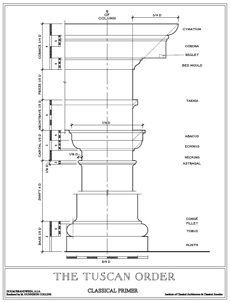
A look at the Tuscan Order shows this proportional relationship at work. First all the parts of the order relate to the column diameter. The column is THE unifying element, labeled as “D”. Note at the bottom, the base is sized 1/2 D. The size of the base in this example will be 1/2 the size of the diameter of the column. The size of these parts all tie back to the diameter. This means they are all unified and scaled harmoniously.
2. The power of a pause.
In the entablature above, note how many flat plan surfaces make up the entablature. This flat surface is not a place where they forgot something, it is instead a purposeful part of the design. Remember that moldings are a language; moldings communicate and have personality. Try to see the flat area as a pause or break between words. Insteadoftalkingrealfastandnotpausingtotakeabreath. The flat area is a pause or a space between words that helps us read and understand what the moldings are saying.
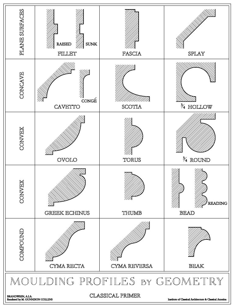
Note on this sheet of classical moldings shapes (ICAA) that they start with flat plane surfaces. This pause is designed into the classical language. It is as much a part of a good molding as any cove or ovolo.
3. More is not better, its worse.
There has a grown a misguided line of thinking among builders and homeowners that if we use more moldings it means the quality of the project is better. Over the last 20 years moldings, especially crown moldings have grown and morphed into silly and bumpy shapes. They are often shaped with haphazard bellies and bruises, corners and angles, all meant to look like more moldings have been used, which of course is better. The idea is, the builder will use 2 heavily figured moldings to make his crown look like he used 6 or 7 steps. It is merely a trick to make his work seem more complex then it really is.
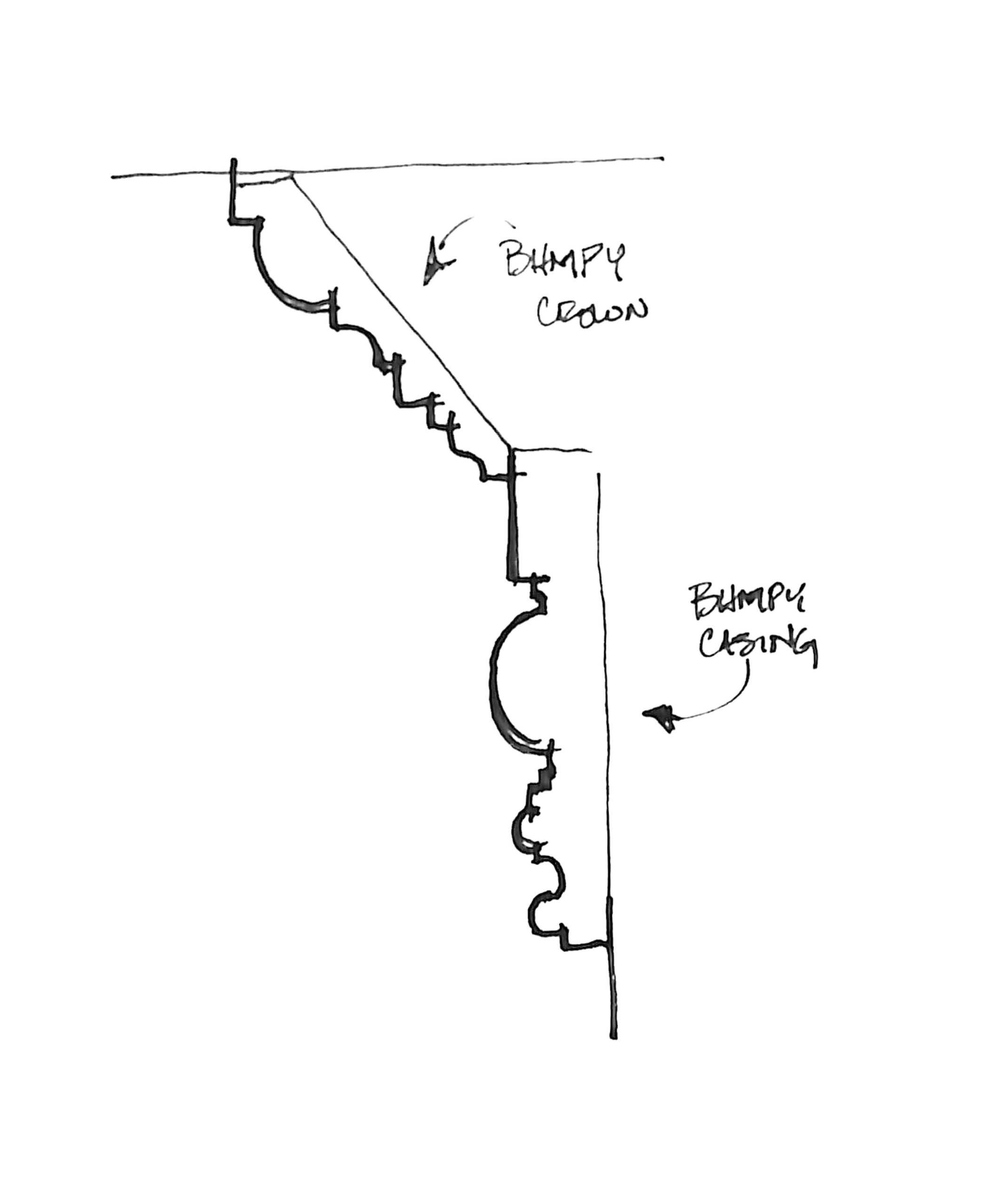
Don’t be fooled. I just left a job in Austin where I found this type of phony-crown. Even though it scaled nearly 9″ across it was only 2 bumpy moldings joined together. The upper (angled) piece is a new “super-crown” filled with too many shapes. The lower molding is just a busy door casing.
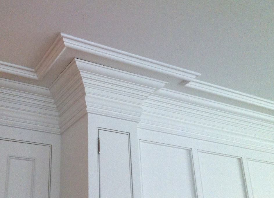
Moldings should be readable. In other words their shapes should communicate a clear message. Look at the picture below. It highlights a good crown vs a bad crown. 1st, the crown on the left is built of many parts that are very difficult to read. Look to the far left, see all the lines on the wall? If you weren’t able to see the corner profile, it is nearly impossible to tell what the crown molding is saying. By contrast, the crown on the right is simple and easy to read. Note the pause, (guideline 2) the long flat shape (called the corona) it gives our eyes a rest. We can read the composition because the pause gives our eyes a place to rest.
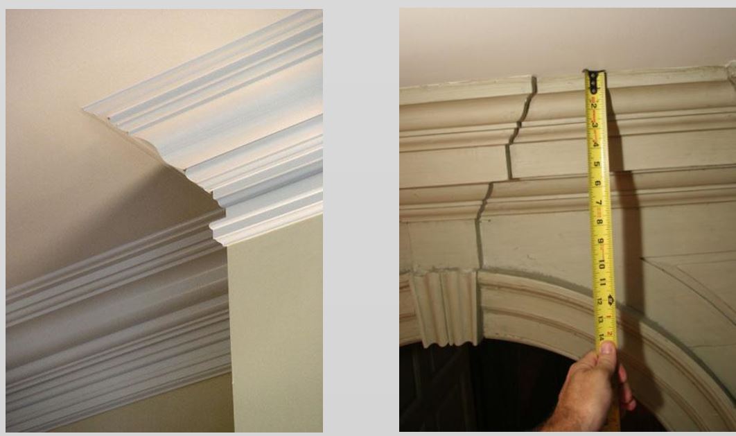
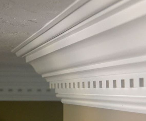
Note too, there is a harmony between parts (Guideline 1) The size of the moldings are proportionate to one another. That is my problem with this crown below. It is one large crown, sandwiched by the small panel molds and dentils. The proportion of the parts is all wrong. Also, note there is no pause. It is an avalanche of dips and turns.
At the end of the day, McMansion crown-molding is just fakery. Much like Jack Black with this ridiculous muscle shirt, it is pretending. Ultimately we are only fooling ourselves.
-B

___________________________________________________________________________
At Hull Millwork, our singular team of master craftsmen excel in fabrication and installation of architectural elements for commercial, civic, historic, and residential projects. View our gallery of millwork projects or contact us today about your next project.

